3 Famous Original Logos You Forgot All About


When you are one of the biggest companies in the software world, everybody knows your products, your services, and last but not least, your logo. They might not remember your first, your original logo, but they certainly know your current logo.
That’s the thing with logos – they change over time. Take Apple, Microsoft and Google for example, three of the biggest companies you can find. While you are familiar with their current logos, you might have forgotten about their original logos. Let me remind you about them.
Apple’s original logo from 1976
Everyone thinks that Apple was founded by Steve Jobs and Steve Wozniak. While that is certainly true, there is a third and often forgotten co-founder: Ronald Wayne. He is the one who designed Apple’s very first logo, back in 1976.
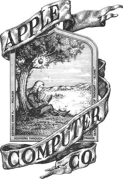
The logo features Sir Isaac Newton sitting under an apple tree, with an apple dangling above his head. The text on the sides reads “Newton… A Mind Forever Voyaging Through Strange Seas of Thought … Alone.”
Wayne’s logo was replaced one year later with the rainbow-colored apple, Apple’s first official logo. Apple used the rainbow apple from 1977 until 1998, when it replaced it with the monochromatic logo that it uses to this day.
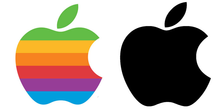
Some say the bite mark is supposed to represent the apple of knowledge from the Garden of Eden. The truth is that the bite mark is there to let you know that you’re looking at an apple, not a cherry. Without the bite mark, the logo would look more like a cherry than an apple.
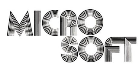
Microsoft’s first logo from 1975
Bill Gates and Paul Allen founded Microsoft in 1975. It’s not surprising then to see that the company’s first logo, which was used from 1975 until 1980, had a distinctive 70s feel.
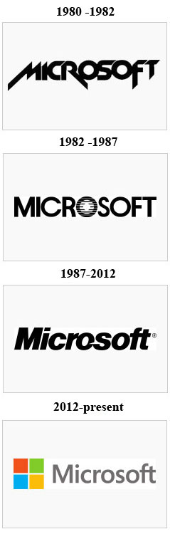
Microsoft’s logo saw lots of changes during the years, as you can see below.
Google’s initial logo from 1997
If your browser’s homepage is set to Google.com, you see Google’s logo every day. While Google’s current logo is fairly good looking, its initial logo from 1997 was an eyesore.

It may look atrocious now, but that was the norm back in the day. And it’s a lot better than the logo for BackRub, the name Larry Page and Sergey Brin initially picked for the search engine.

Google’s current logo was unveiled sooner than you might think, on September 1, 2015. I bring this up so I can mention that Google likes to frequently replace its logo with a doodle.
Google does this to celebrate important holidays, achievements and people – including the most important person of all, you. Google will display a special doodle on your birthday if you’re signed into your Google account and if you added your date of birth to your profile.

Honorable mention – Firefox’s “Phoenix” logo from 2002
Mozilla’s Firefox web browser wasn’t always called Firefox. Back in 2002, when the Firefox project began, it was called Phoenix, just like the mythical firebird that rose from its own ashes.

That, of course, was a reference to Netscape getting killed off by Microsoft and Internet Explorer. Due to trademark issues, the project was later renamed as Firefox.
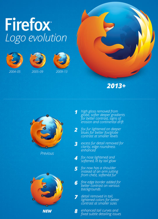
Mozilla’s newest logo was unveiled in 2013. The infographic below lists the main things that changed, compared to the previous version, of course.
That’s the thing with logos – they change over time. Take Apple, Microsoft and Google for example, three of the biggest companies you can find. While you are familiar with their current logos, you might have forgotten about their original logos. Let me remind you about them.
Apple’s original logo from 1976
Everyone thinks that Apple was founded by Steve Jobs and Steve Wozniak. While that is certainly true, there is a third and often forgotten co-founder: Ronald Wayne. He is the one who designed Apple’s very first logo, back in 1976.
The logo features Sir Isaac Newton sitting under an apple tree, with an apple dangling above his head. The text on the sides reads “Newton… A Mind Forever Voyaging Through Strange Seas of Thought … Alone.”
Wayne’s logo was replaced one year later with the rainbow-colored apple, Apple’s first official logo. Apple used the rainbow apple from 1977 until 1998, when it replaced it with the monochromatic logo that it uses to this day.
Some say the bite mark is supposed to represent the apple of knowledge from the Garden of Eden. The truth is that the bite mark is there to let you know that you’re looking at an apple, not a cherry. Without the bite mark, the logo would look more like a cherry than an apple.
Microsoft’s first logo from 1975
Bill Gates and Paul Allen founded Microsoft in 1975. It’s not surprising then to see that the company’s first logo, which was used from 1975 until 1980, had a distinctive 70s feel.
Microsoft’s logo saw lots of changes during the years, as you can see below.
Google’s initial logo from 1997
If your browser’s homepage is set to Google.com, you see Google’s logo every day. While Google’s current logo is fairly good looking, its initial logo from 1997 was an eyesore.
It may look atrocious now, but that was the norm back in the day. And it’s a lot better than the logo for BackRub, the name Larry Page and Sergey Brin initially picked for the search engine.
Google’s current logo was unveiled sooner than you might think, on September 1, 2015. I bring this up so I can mention that Google likes to frequently replace its logo with a doodle.
Google does this to celebrate important holidays, achievements and people – including the most important person of all, you. Google will display a special doodle on your birthday if you’re signed into your Google account and if you added your date of birth to your profile.
Honorable mention – Firefox’s “Phoenix” logo from 2002
Mozilla’s Firefox web browser wasn’t always called Firefox. Back in 2002, when the Firefox project began, it was called Phoenix, just like the mythical firebird that rose from its own ashes.
That, of course, was a reference to Netscape getting killed off by Microsoft and Internet Explorer. Due to trademark issues, the project was later renamed as Firefox.
Mozilla’s newest logo was unveiled in 2013. The infographic below lists the main things that changed, compared to the previous version, of course.