Opera Software Presents a New Brand Identity and a Stunning New Logo

Opera Software, the Norwegian company behind the innovative and feature-rich Opera web browser, recently introduced a new brand identity and a stunningly beautiful new logo.
“It’s time for a consistent brand identity that reflects what Opera is about,” said Sean D'Arcy, VP Global Marketing and Distribution, Opera Software. “We want to enable more people, in more places, to experience what matters, when it matters most.”
Did you know that Opera Software turned 20 this year? The Norwegian software developer has been around for two decades!
The company is so big now, and the Opera web browser is so popular, that it is used by more than 350 million people around the world.
On top of that, Opera’s subsidiary mobile-advertising company, Opera Mediaworks, manages to reach around 1.1 billion people. That’s…a lot!
It’s now more important than ever for Opera Software to show the world what it is all about. With the aim of doing just that, the company introduced a new brand identity.
Here’s the video presentation for Opera’s new identity.
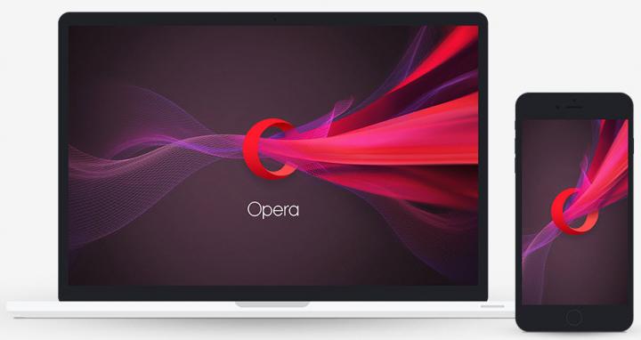
Did you like what you saw in the video? Because, I have a treat for you. Opera Software published this desktop wallpaper and this mobile wallpaper for fans who want to bring Opera’s new brand onto their devices. Here’s a preview.
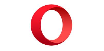
The most important part of Opera’s new brand identity is its new logo – which, I have to say, is quite stunning.
Here’s how Opeara's new logo looks like.
And here’s Sean D'Arcy again, explaining the logo’s deeper meaning:
“We envision Opera’s new logo as a portal quickly connecting you with what you’re looking for on the web. The 3-dimensional ‘O’ symbolizes a gateway that leads you to more: more content, more discoveries, more answers, more communication, more fun, more data savings, more of life – whatever you seek online, Opera helps you do more!”
There’s another important thing you need to know about Opera’s new logo – the “Software” part has been dropped. The logo that used to say Opera Software in the past, says only Opera now. Why you ask? Sean D'Arcy offered this explanation:
“With the extended Opera family and our ever-expanding range of products and services, we feel we’ve grown beyond the bounds of a software company. Today, we see Opera more as an internet company providing great experiences online. To reflect this, we have dropped the ‘Software’ from our logo.”
And I end this article with a video that shows how the Opera logo evolved for the past 20 years.
The new Opera brand and the new Opera logo are being rolled out across Opera’s domains and across the company’s product portfolio. The rollout is expected to complete over the next few months.
“It’s time for a consistent brand identity that reflects what Opera is about,” said Sean D'Arcy, VP Global Marketing and Distribution, Opera Software. “We want to enable more people, in more places, to experience what matters, when it matters most.”
Did you know that Opera Software turned 20 this year? The Norwegian software developer has been around for two decades!
The company is so big now, and the Opera web browser is so popular, that it is used by more than 350 million people around the world.
On top of that, Opera’s subsidiary mobile-advertising company, Opera Mediaworks, manages to reach around 1.1 billion people. That’s…a lot!
It’s now more important than ever for Opera Software to show the world what it is all about. With the aim of doing just that, the company introduced a new brand identity.
Here’s the video presentation for Opera’s new identity.
Did you like what you saw in the video? Because, I have a treat for you. Opera Software published this desktop wallpaper and this mobile wallpaper for fans who want to bring Opera’s new brand onto their devices. Here’s a preview.
The most important part of Opera’s new brand identity is its new logo – which, I have to say, is quite stunning.
Here’s how Opeara's new logo looks like.
And here’s Sean D'Arcy again, explaining the logo’s deeper meaning:
“We envision Opera’s new logo as a portal quickly connecting you with what you’re looking for on the web. The 3-dimensional ‘O’ symbolizes a gateway that leads you to more: more content, more discoveries, more answers, more communication, more fun, more data savings, more of life – whatever you seek online, Opera helps you do more!”
There’s another important thing you need to know about Opera’s new logo – the “Software” part has been dropped. The logo that used to say Opera Software in the past, says only Opera now. Why you ask? Sean D'Arcy offered this explanation:
“With the extended Opera family and our ever-expanding range of products and services, we feel we’ve grown beyond the bounds of a software company. Today, we see Opera more as an internet company providing great experiences online. To reflect this, we have dropped the ‘Software’ from our logo.”
And I end this article with a video that shows how the Opera logo evolved for the past 20 years.
The new Opera brand and the new Opera logo are being rolled out across Opera’s domains and across the company’s product portfolio. The rollout is expected to complete over the next few months.


