Faster and Stable Chrome 2.0, Sharper Google Logos

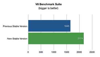
Good news for those of you out there that are currently using Google Chrome 1.0, the (formerly) stable version of the Google developed web browser – the once Google Chrome 2.0 Beta has finally reached “stable” status, meaning that you can put the Chrome 1.0 to rest and switch to Chrome 2.0 Build 2.0.172.28. Why would you give make the switch to Chrome 2.0 stable? Since you re obviously the kind of person that appreciates web browsing speed, you will certainly appreciate the fact that Chrome 2.0 comes with a 30% speed increase.
Google Chrome team member, Darin Fisher, comments: “We introduced Google Chrome back in September, and it's received a great response so far. Since launching, we've been working hard on adding the top requested features and making Google Chrome even faster. Today, we are updating to a new version of Google Chrome that is faster than ever. JavaScript-heavy web pages will now run about 30% faster. Additionally, we've added some useful features like form autofill, full screen mode, and the ability to remove thumbnails from the New Tab page.”
If you would like to watch a video showcase of Chrome 2.0’s new features, a YouTube link is available here.
If you would like to get Chrome 2.0 Stable, a download location is available here.
Chrome 2.0 stable is a great offering for the regular user, but there is a Chrome 2.0 offering for devs as well – Chrome 2.0 version 2.0.181.1 which comes with changes to WebKit, V8 JavaScript engine and Google Gears.
Engineering Program Manager, Jonathan Conrad, is the one who announced the release of the Chrome 2.0 dev channel update: “Google Chrome has been updated to 2.0.181.1 on the dev channel. This release contains many localization, crash, and UI behavior fixes. Version Changes: WebKit - 530.11, V8 - 1.2.4.1, Gears - 0.5.21.0”
Last but not least, the Mountain View search engine giant is doing some visual work on its logos. According to VP of Search Products and User Experience, Marissa Mayer, and Senior Visual Designer, Jamie Divine, the logo re-design will help Google streamline its user experience.
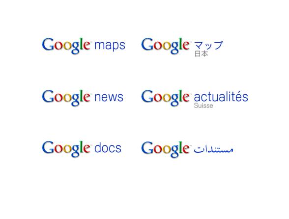
“We hope this design freshens up our look as well as improves consistency and ease of use across our sites. Now, our product names will appear in clean, simple blue lowercase type alongside the Google logo. Since the logos appear in many different locations and sizes on our websites, our new designs are standardized to be the same size and color wherever they appear. This should make it easier for you to recognize which site you are on and navigate to wherever you want to go. They are also consistent across all our international domains, which is especially helpful for people using right-to-left languages such as Arabic and Hebrew," explained Mayer and Divine.
Google Chrome team member, Darin Fisher, comments: “We introduced Google Chrome back in September, and it's received a great response so far. Since launching, we've been working hard on adding the top requested features and making Google Chrome even faster. Today, we are updating to a new version of Google Chrome that is faster than ever. JavaScript-heavy web pages will now run about 30% faster. Additionally, we've added some useful features like form autofill, full screen mode, and the ability to remove thumbnails from the New Tab page.”
If you would like to watch a video showcase of Chrome 2.0’s new features, a YouTube link is available here.
If you would like to get Chrome 2.0 Stable, a download location is available here.
Chrome 2.0 stable is a great offering for the regular user, but there is a Chrome 2.0 offering for devs as well – Chrome 2.0 version 2.0.181.1 which comes with changes to WebKit, V8 JavaScript engine and Google Gears.
Engineering Program Manager, Jonathan Conrad, is the one who announced the release of the Chrome 2.0 dev channel update: “Google Chrome has been updated to 2.0.181.1 on the dev channel. This release contains many localization, crash, and UI behavior fixes. Version Changes: WebKit - 530.11, V8 - 1.2.4.1, Gears - 0.5.21.0”
Last but not least, the Mountain View search engine giant is doing some visual work on its logos. According to VP of Search Products and User Experience, Marissa Mayer, and Senior Visual Designer, Jamie Divine, the logo re-design will help Google streamline its user experience.
“We hope this design freshens up our look as well as improves consistency and ease of use across our sites. Now, our product names will appear in clean, simple blue lowercase type alongside the Google logo. Since the logos appear in many different locations and sizes on our websites, our new designs are standardized to be the same size and color wherever they appear. This should make it easier for you to recognize which site you are on and navigate to wherever you want to go. They are also consistent across all our international domains, which is especially helpful for people using right-to-left languages such as Arabic and Hebrew," explained Mayer and Divine.